05/2024
The future starts with F as Frattini
A restyling catching the essence of the brand
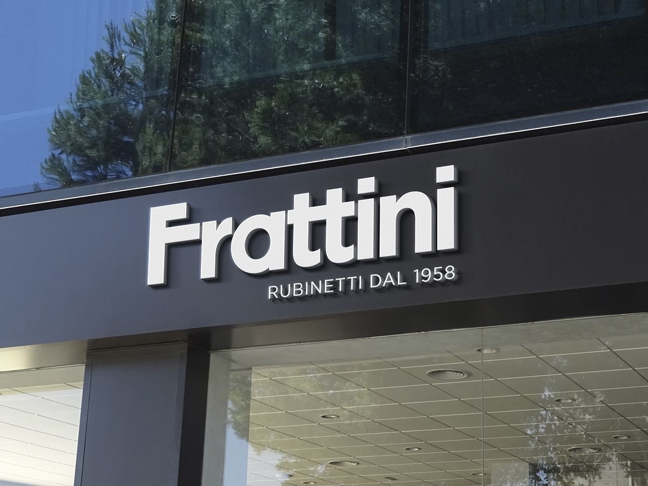
At the Salone del Mobile 2024, the new Frattini logo debuts, symbolizing the beginning of an important chapter for the company. It replaces the previous, more complex and detailed one, introduced in 1990 and which fully presented the company name of Rubinetterie Fratelli Frattini Spa. The term “brothers” disappears. A symbolic choice that marks the milestone of the second generation at the helm of the company: the founders Benito and Pierluigi are no longer the protagonists, but only Giuseppino Frattini, president and still precious advisor to his grandchildren Gloria and Maurizio and his daughters Michela and Francesca.
Which is the shape of the new Logo?
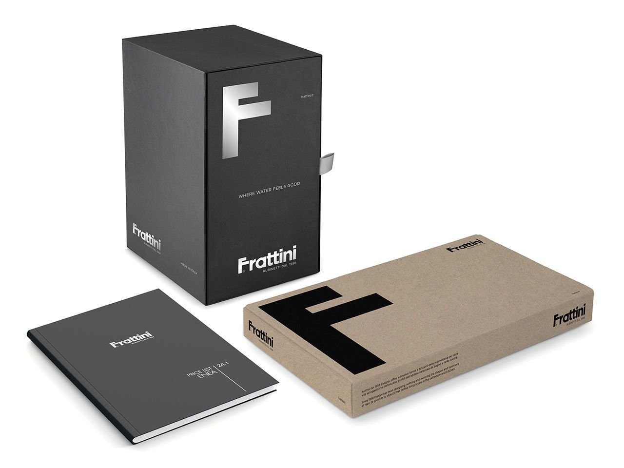
The new Frattini logo stands out for its clean, soft and reassuring lettering. A striking feature is the initial "F", which transforms into the silhouette of a faucet. This detail becomes an autonomous symbol, ready to be used and promoted individually. The logo proposal is decidedly contemporary, supported by a clear and direct payoff: "Taps since 1958".
Meaning and vision of the new Logo
Michela Frattini, marketing manager at Frattini, examines the importance of rebranding and the effectiveness of the new logo:
"In creating the logo, we went beyond the simple representation of the surname to also include the image of a mixer, thus underlining our historical role in the sector. The symbol renews our heritage, transforming it into a distinctive value. The reassuring and innovative logo lettering and payoff demonstrate our promise of authenticity and progress."
The change represents a modern reading of the brand, which transmits all the fundamental values of its history: "F" stands for Frattini, but also for Future, Faith and Family. The graphic transformation marks a revolution for the company, destined to mark an important chapter in the company's history. It will change all the institutional materials and will be at the center, together with the new collections, of the advertising campaign, for which a new claim has been created.
Why the new claim “Where Water Feels Good?
The new claim "Where Water Feels Good" emphasizes the authority of our brand and many years of experience in the plumbing sector. For decades, our company has been committed to making water, the most precious commodity, the protagonist in bathrooms. The slogan captures the essence of WATER as a source of life and well-being, underlining how its power transforms into comfort and pleasure when it flows from our taps.

The creative process behind the rebrand
Frattini's rebranding was handled by Noodles Comunicazione of Turin, with Marco Prunotto, founder and creative director, leading the project. Prunotto explains the complexity of the assignment:
"Dealing with the revitalization of a brand that must convey corporate values is always a challenge, especially when it comes to an historical brand. It is a process that goes beyond simple design; it is an immersion in family and business dynamics to establish a relationship of trust." He continues by reflecting on the specificity of working with the company: “The Fratelli Frattini brand has a rich heritage and a solid reputation. Our mission has been to preserve these values while making them accessible in a modern context. Frattini is not just a faucet manufacturer, is a true Italian excellence in the sector."
A future built on clear values
The change in our brand is deep and completely transforms its perception, elevating it to new levels of excellence and trust. We sought clarity, aiming for an idea that was universally understandable. The solution was always before our eyes. Frattini's large "F", now redesigned, has been transformed into a stylized icon of a tap.
Simplification represents the strength of design and the essence of our identity: simplicity and authenticity. Frattini has been synonymous with quality in the tap sector since 1958. With the renewed image of the brand, we have consolidated the message, focusing on the name "Frattini" as the sole spokesperson for our history and our values. Now, the task is to implement and live the new symbol in communication and products.